You’ve searched high and low for the perfect product for your client’s promotion, you receive the virtual but it’s still lacking that ‘wow’ factor. What can you do?
Amp up the imprint!
One way to do this is to play with what goes in the imprint area. No matter what you add, it’s all going to cost the same (as long as you stay in the imprint color parameters).
Logo
Logo + Website
Logo + Website + Sponsor
Logo + Website + Sponsor + Themed Art
So why are so many companies just slapping their logo on a product and calling it a day? Company guidelines? Maybe. Lack of creativity? Probably.
Here are some ideas on how to take your logo and elevate it into something special by simply embellishing the imprint.
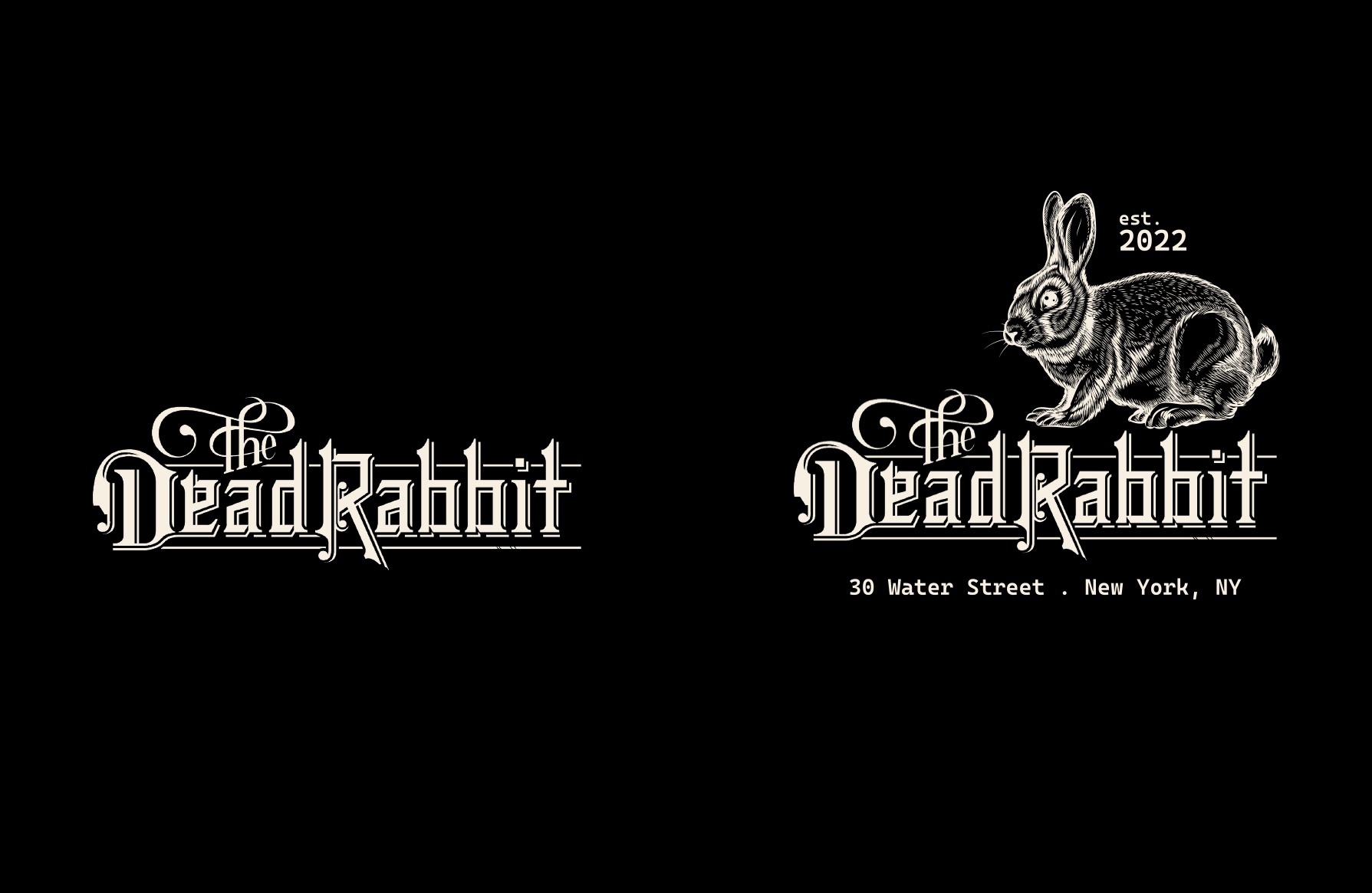
This is a great pub logo but I accentuated it by adding the address, year established, and imagery.
Even if you prefer a minimalist/cleaner look, you can still enhance your logo with some form of contact information and/or small details.
If you or your client don’t have someone on staff to help with design, check with your suppliers to find out how much their Art Charge is. A flat fee of $25 or $50 could be worth it if it means the final artwork amplifies the promotion into something more unique and increases its perceived value.
Another way to do more with your imprint area is to play with its location. If the product you chose offers multiple imprint locations, choose something that isn’t so standard *cough* left chest *cough*. This really lends itself to apparel, but there are hardgoods available with alternative imprint locations.

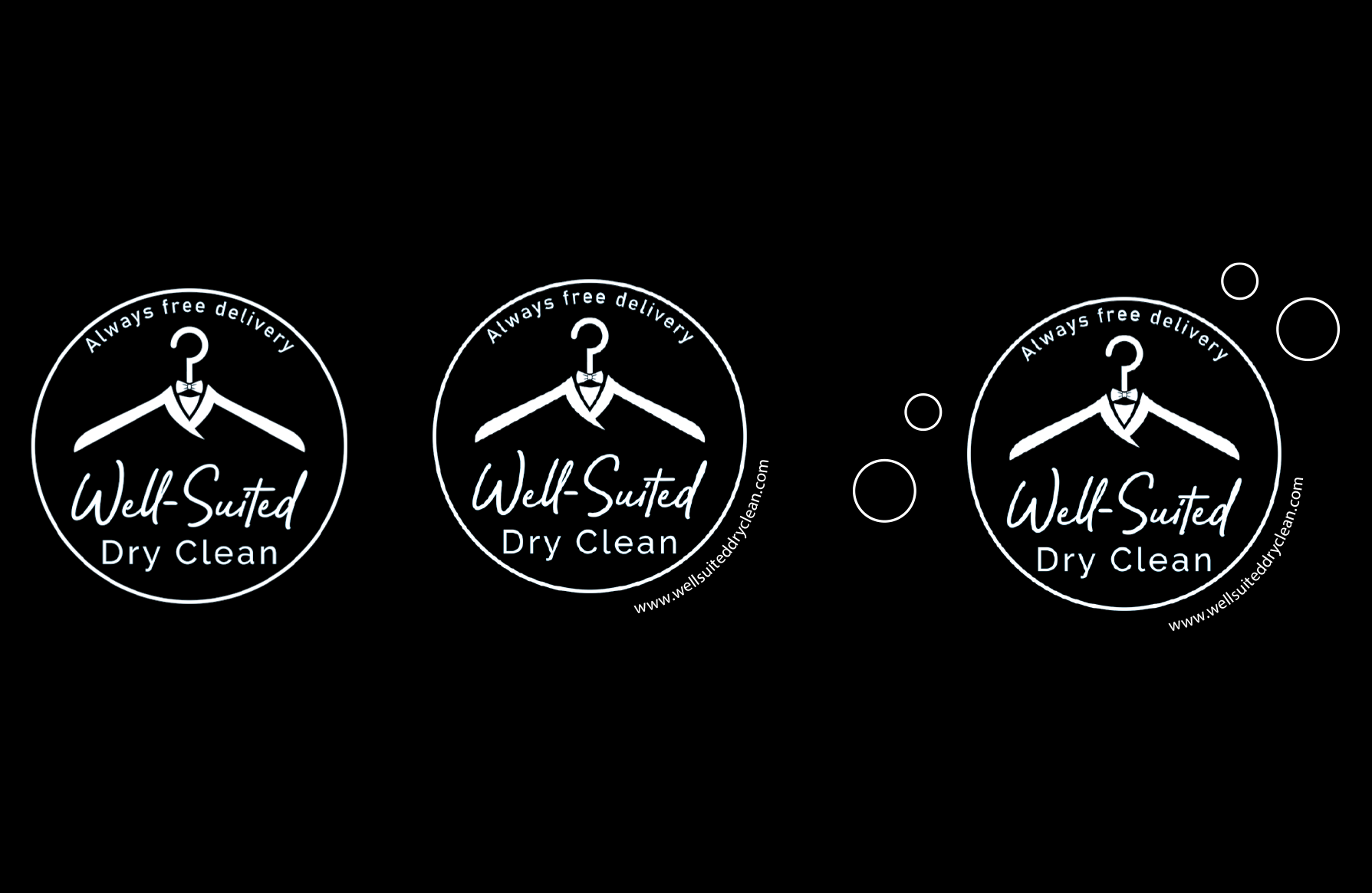
This is great if you prefer to keep the imprint simple. Above we see the standard logo done as a wrap on a basic tee.
Lastly, play with color (or lack of). Tone on tone gives a modern, luxurious look while black and white keeps things classic. On the flip side, neon colors offer a pop of fun and jewel tones provide a more serious vibe. And don’t forget, if the budget allows, take advantage of full color imprints.
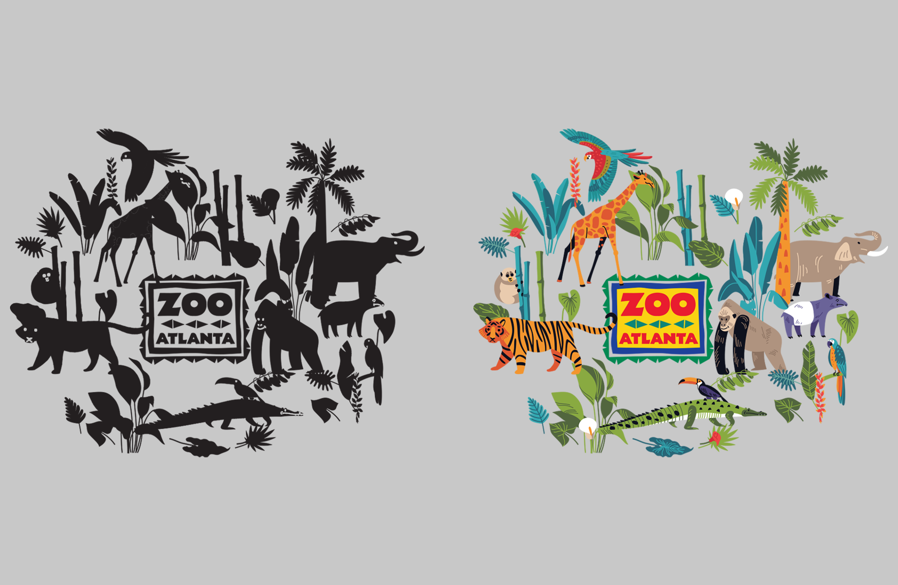
A completely custom product may not be in the budget but adding a full color imprint can give the same feeling.
You can easily help your clients think outside the box while remaining in their budget by suggesting one of the easy “imprint hacks” above.
[Chick-Fil-A imagery https://www.restaurantbusinessonline.com/marketing/heres-look-chick-fil-first-merchandise-line]

Jessica is the Art Director at PromoCorner and has been in the promotional products industry since 2010. With a degree in Graphic Design, she has been working in Marketing since 2006 creating advertising of all sizes; from social posts to billboards. Jessica shares her passion for design in her monthly blog, Designer Patch. She can be reached at
jessica@promocorner.com.